Here's the chart:
I really liked this chart when I first saw it. But can you see the problem here?
Let's look at the chart on the left. The "Meat, Dairy" value is given as 73.8% and the "Grain" is at 13.23%. So the Meat value is about 5 times more than Grain. But a pyramid naturally shows a ratio of volume, not height.
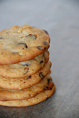
Think about it like a stack of cookies.
Each cookie is the same size, and this makes a column. So we can see one cookie in relation to the other 4.
Each cookie is the same size, and this makes a column. So we can see one cookie in relation to the other 4.
Since the pyramid gets wider the farther away from the peak, the lower layers need to be adjusted for their heights. Otherwise it's like our bottom cookies are bigger than the top ones, and so we're inflating the value of the lower stacks. If you take a look at the pyramid again, and eyeball the front triangle, Grain is about 1/5th the height of Meat. But since the pyramid kept the width and depth the same for all layers, it shows Meat as a lot more dominant than Grain. In fact, we don't even know how deep or wide the pyramid is supposed to be - is the length of the base the same as the height? So we don't really know from the visual what the ratios are. The numbers give us this information, but the graph doesn't correspond to those values.
According to Stubborn Mule:
"These variants on three-dimensional graphics all represent the trap “chart junk”: fancy extra details that, at best, add nothing to the information being conveyed and, at worst, result in distortion. Cones and pyramids fall well into the distortion category."
So you want to be careful that when you're reading graphs, you're not getting confused by poor data presentation.
cookie image:


No comments:
Post a Comment